Contemporary color grading classes, i.e. teal orange are nothing strictly bad per se.
Every director and film maker has his own freedom of portraying the color in a way he envisions them.
Modern color grading however is becoming unacceptable if it's about to restore original films and applying a contemporary color-look, destroying the original vision during the process.
This is something real that is happening. Often it's not the original directors that are to blame, but the producers, whoever owns the right on a film can release them as they like, applying a certain look during the process as they want.
A good example of what can happen to a film in a modern day re-release.
For this example let's take a look at Aliens the Blu Ray release.

(Left Blu Ray- Right DVD)
Courtesy notonbluray.com

(100% teal and orange)

(Typical dynamic-range pandering for Blu Ray.
Ripley feels a little sick)

(More orange is always modern)

(Purple tones are exchanged with a curtain
of teal'ish blue, covering the whole spectrum)
Courtesy to darkhorizons.com
Let's be honest here and admit that the images don't look simply bad. But for many lovers of the movie they will forever change and alter the original vision.
There was an outcry in the Aliens fan community for this pandering of color-timing.
There was an outcry in the Aliens fan community for this pandering of color-timing.
-
Let's look at The Terminator Blu Ray release.
(Kyle Reese is feeling sick or has become a victim
of modern color grading)
Courtesy to notonbluray.com
The real loosers in this process are casual movie fans that won't even notice the changes.
They simply think they are offered the newest in tech, while presented a pandered, altered look.
Common sense should tell you that the new look is not better but simply forcefully altered.
That fact is even more striking if you consider that James Cameron (director and creator of The Terminator) is the original coiner of the ultra-blue look that was a certain look established by his first movies.
Not so blue now.
Ironically the "Blu Ray" exchanges everything ultra-blue with a somewhat unrecoverable palette of teal.
-
Let's look at the Raiders of the Lost Ark Blu Ray release.
This is a movie I have the most problems with.
For it alters the perception of the movie as I learned to love it.
For it alters the perception of the movie as I learned to love it.

(There is a strong reddish tint that covers the entire movie.
Having such orange tones covering the whole picture is not natural)
Having such orange tones covering the whole picture is not natural)
Video Comparison Blu-Ray vs HDTV broadcast:
This is not how any of the fans remember the movie, not as it
was shown in TV or former home releases, past 30 years.
It makes any long-term fan forced to re-evaluate the pictures, somehow
feel uncomfortable. Some might not even being able to put it in words.
The looser are the casual film-fans that watch the movie and are robbed of an original
envisioning of a movie.
There was an outcry in the fan-community and the decision clearly refuted.
Multiple comparisons with theatrical showings uncovered the natural colors, which where not pandered with the silky orange present in the Blu Ray.
Spielberg is recorded to say that this is more in vision of the original Theatrical release in term of color timing. I don't believe this for a moment.
Long time fans say the color decision was made to make the movie match up with the fourth in series: Indiana Jones and the Kingdom of the Crystal Skull.
I believe the later.
I believe in a strong pressure of marketing decisions that are accountable for the color timing.
-
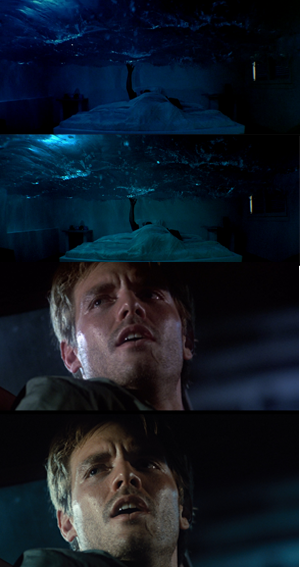
Let's look at the Jurassic Park 3D Blu Ray release vs the original 2D Blu Ray

(Where is the light?)


(Upper Blu Ray 2d, lowed Blu Ray 3D.
A constant wash of warm colors totally diminishes
the perception of reality and submerges everything
to a constant state of dusk)
Video Comparison 3D vs 2D Blu Ray
A blanket of sugar sweet orange over the whole movie.
We understand that orange is a sweet color.
If one considers presenting this movie theatrically, with those color it is almost unbelievable.
A movie is normally perceived much darker due the 3D glasses, when the
Picture is that tinted and darkened, you are left with a wash of bad
visuals.
People are reported to almost walk out of the Theater for the colors.
The general trend is towards a very dark picture, combined with the usual teal and orange.
Giving it an overall tinted subdued look. One can especially notice that in the Nedry picture (the top most one).
As mentioned, those colors are not too bad per se. Nothing speaks against being contemporary with the color-timing.
But if those warm shades are applied to the whole picture during the course of a full movie. It leaves a sick feeling.
Like being forced to walk with a crutch when you can walk just fine. If someone is forcefully telling you to feel happy during each scene.
For some scenes this does just not work.
My eyesight works just fine thank you very much.
When those color choices are pandering with movie classics that people learned to love for their certain looks, then those beloved movies are taken away from the fans.
Broadcasts are exchanged with updated digital releases that match those new presentations. Cultural Icons are forever altered.
What we learn from modern color looks is that however a movie is altered,
it is always either orange or teal. This is no possible way of any form of creativity but simply a restrictive sickness.
What we learn from modern color looks is that however a movie is altered,
it is always either orange or teal. This is no possible way of any form of creativity but simply a restrictive sickness.
This comment has been removed by the author.
ReplyDeleteThis comment has been removed by the author.
ReplyDeleteSome of your ideas are extremely misguided. One could say Kyle Reese no longer looks like his head is going to pop off from being so red and pink. Cameron almost certainly modernized the look to make it seem more authentically modern and not stuck in the 80s. I think he did a great job overall. He would know best wouldn't he? I mean these are his films right? Not yours.
ReplyDeleteI believe the artist can do whatever he wants with his films.
And many people agree the 80s red push looks awful in a wide variety of films. It might give the semblance of being more realistic, but it never sets any tone to the film. It looks gross and gaudy to me. When offered the chance many of these directors simply never wanted that look in the first place. Too much teal can surely be a problem. But in general the Terminator regrading I think fits the film perfectly.
The Jurassic Park one is a little crazy, and there are some other questionable choices, but overall this is the digital age and directors have more power to change their films to exactly how they want it.
Temple of Doom? The film never looked properly graded before. It was cold, dark, and awful looking, exactly the opposite of what the actual film was going for in many places. Now it actually has some charm, but they still need to do a 4K HDR version.
At any rate you seem like you just want things the way they were when you saw them. Or how you think you remember them. You want to own them and control them yourself.
Bud, make your own art then.
So I agree with you on some things but totally disagree on most of this rant. These people made the films. It's their art in effect. You grew up loving them in some way. You want this you want that. Well, it isn't yours to have. Period.
Totally agree!!!!
ReplyDeleteThey are "teal-raping" movies abd selling them to us as the coolest latest blu ray restoration.
Year = 2025, and this "tealing" that I started noticing years ago, is becoming rampant. It is most obvious when binge-watching a series that started with normal, "good" coloring, but later seasons started having this abhorrent teal/orange relative-enhancement. This "tealing", for me, usually makes scenes depressing, sickening, hideous, and less realistic. I am very interested in knowing what % of viewers share this value. I suspect that the majority would have minimally a minor preference for less "tealing". Some are likely insensitive or otherwise apathetic to it. But I would be shocked to learn that more than 20% actually generally prefer it.
ReplyDeleteAnd more work is warranted now, to confirm that a movie release has the expected or otherwise-acceptable coloring. We cannot just buy the 4K Blu-ray release of an older movie, and safely expect that it will be a good representation of what the director intended, what original audiences saw, or what you had seen color-wise in earlier releases of decent quality, but with greater definition or possibly better audio, or even greater color-range/gamut (but otherwise like what was previously available). When shopping for the one release to be a movie's representative in a libary (most of us do not want 3 release-versions of the same movie), or even be our 1st viewing, we must determine what releases are available, and find comparisons that address this color issue, ideally with images.
An example of my recent disappointment is the Criterion 4K release of Sorcerer (1977). A side-by-side comparison with the Warner Brothers 2014+ Blu-ray releases, well demonstrates this phenomenon. Most scenes (in my sampling) were much worse, with a few being okay despite being quite different.