Thursday, June 25, 2015

Teal and Orange™ Watch

Here is a reminder of how modern color grading is destroying original movies.

Contemporary color grading classes, i.e. teal orange are nothing strictly bad per se.
Every director and film maker has his own freedom of portraying the color in a way he envisions them.

Modern color grading however is becoming unacceptable if it's about to restore original films and applying a contemporary color-look, destroying the original vision during the process.

This is something real that is happening. Often it's not the original directors that are to blame, but the producers, whoever owns the right on a film can release them as they like, applying a certain look during the process as they want.

A good example of what can happen to a film in a modern day re-release.
For this example let's take a look at Aliens the Blu Ray release.

(Left Blu Ray- Right DVD)
Courtesy notonbluray.com

(100% teal and orange)
(Typical dynamic-range pandering for Blu Ray.
Ripley feels a little sick)
(More orange is always modern)
(Purple tones are exchanged with a curtain
of teal'ish blue, covering the whole spectrum)

Courtesy to darkhorizons.com

Let's be honest here and admit that the images don't look simply bad. But for many lovers of the movie they will forever change and alter the original vision.
There was an outcry in the Aliens fan community for this pandering of color-timing.

-

Let's look at The Terminator Blu Ray release.
(Kyle Reese is feeling sick or has become a victim
of modern color grading)

Courtesy to notonbluray.com

The real loosers in this process are casual movie fans that won't even notice the changes.
They simply think they are offered the newest in tech, while presented a pandered, altered look.
Common sense should tell you that the new look is not better but simply forcefully altered.
That fact is even more striking if you consider that James Cameron (director and creator of The Terminator) is the original coiner of the ultra-blue look that was a certain look established by his first movies.
Not so blue now.
Ironically the "Blu Ray" exchanges everything ultra-blue with a somewhat unrecoverable palette of teal.

-

Let's look at the Raiders of the Lost Ark Blu Ray release.
This is a movie I have the most problems with.
For it alters the perception of the movie as I learned to love it.
(There is a strong reddish tint that covers the entire movie.
Having such orange tones covering the whole picture is not natural)
Video Comparison Blu-Ray vs HDTV broadcast:

This is not how any of the fans remember the movie, not as it
was shown in TV or former home releases, past 30 years.
It makes any long-term fan forced to re-evaluate the pictures, somehow
feel uncomfortable. Some might not even being able to put it in words.
The looser are the casual film-fans that watch the movie and are robbed of an original
envisioning of a movie.
There was an outcry in the fan-community and the decision clearly refuted.
Multiple comparisons with theatrical showings uncovered the natural colors, which where not pandered with the silky orange present in the Blu Ray.


Spielberg is recorded to say that this is more in vision of the original Theatrical release in term of color timing. I don't believe this for a moment.
Long time fans say the color decision was made to make the movie match up with the fourth in series: Indiana Jones and the Kingdom of the Crystal Skull.
I believe the later.
I believe in a strong pressure of marketing decisions that are accountable for the color timing.

-

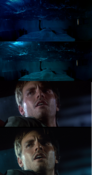
Let's look at the Jurassic Park 3D Blu Ray release vs the original 2D Blu Ray

(Where is the light?)

(Upper Blu Ray 2d, lowed Blu Ray 3D.
A constant wash of warm colors totally diminishes
the perception of reality and submerges everything
to a constant state of dusk)

Video Comparison 3D vs 2D Blu Ray

A blanket of sugar sweet orange over the whole movie.
We understand that orange is a sweet color.

If one considers presenting this movie theatrically, with those color it is almost unbelievable. A movie is normally perceived much darker due the 3D glasses, when the Picture is that tinted and darkened, you are left with a wash of bad visuals.
People are reported to almost walk out of the Theater for the colors.
The general trend is towards a very dark picture, combined with the usual teal and orange.
Giving it an overall tinted subdued look. One can especially notice that in the Nedry picture (the top most one).


As mentioned, those colors are not too bad per se. Nothing speaks against being contemporary with the color-timing.
But if those warm shades are applied to the whole picture during the course of a full movie. It leaves a sick feeling. 
Like being forced to walk with a crutch when you can walk just fine. If someone is forcefully telling you to feel happy during each scene.
For some scenes this does just not work.
My eyesight works just fine thank you very much.

When those color choices are pandering with movie classics that people learned to love for their certain looks, then those beloved movies are taken away from the fans.
Broadcasts are exchanged with updated digital releases that match those new presentations. Cultural Icons are forever altered.


What we learn from modern color looks is that however a movie is altered,
it is always either orange or teal. This is no possible way of any form of creativity but simply a restrictive sickness.

Tuesday, June 23, 2015

Why I don't watch new movies anymore

Yes, this is all about the color-grading.

The first counter-thought about that would instantly be something like this "It's just a movie", "relax and enjoy the fun".

My argument would be: I can't relax and enjoy, because the colors on the giant canvas I'm focusing my eyes on are totally off putting, to say exactly they destroy the sense of believe.
If one thing pulls you out of a movie, the latest thing to do so should be the actual visuals.
One can say a movie is 50% visuals and 50% sound.
The eyes however do a much larger part occupying the brain. Say every color takes a part of brain-power, there are 3 colors and the millions of various shades the brain can calculate out of those.

According to that I would say; 75% of the sensory experience in a movie is visuals.
The story does not take brain-power in the context of being sensory, but is instead processed solely by logic.
A story can be a wonderful in modern movies, still.
There are movies I really looked forward to watching; i.e. Interstellar, Jurassic World, Mad Max. The reason and solely so I can't watch those movies, are the colors.

I can no longer commit myself to a movie when I'm constanly flooded by a flash of un-natural colors.
A movie should never be just a movie, but a complex piece of art that's a masterful combination of various elements.
The argument of just being a movie is so futile that it does not even count.
Say that to Spielberg, say that to yourself and you go watch a porn, because it's still a movie after all.
In reality every little detail does indeed count.
The other point being; that if it's just a movie anyway, everyone is condemning himself from making any critique at all.

Constantly I feel under-involved and reduced to a sensory idiot.
It feels like trying to walk, while someone is forcing you to use a clutch.
Those colors that are imposed generally in modern blockbuster movies, not just blockbusters but actually every, dam, single movie.
One can strife off the genre to the artfilm genre or independent, comedy, drama and post-apocalyptic movies, they all look the same.
And the same is nor a overstatement or bold generalization. It is the absolut unmasked truth.

This would not be a problem actually if there would still be variety - but at is has become a absolute degree of measure, a guideline or chart of how to present a movie that nobody dare can leave and is absolutely constrained to, no exclusivity from ever.
Not even the new Star Wars movie seems to be able leaving this cage.
Jurassic World could not.
Indiana Jones 4 did and every future movie, without any denial will.
Expect there will soon be a change, that does not seem realistic at all.

No, I cannot watch a movie when someone is telling me the whole story from the beginning. I can't watch a movie if I'm basically insulted to ever use my brain on my own for one moment.
The eyesight of a human being has evolved during the past several million years.
A perfectly developed tool to process visual information that is so darn accomplished it can perceive depth, motion and finest variations of color-shades.
It is so precise that it is able distinguishing living beings from static backgrounds, in nearly every possible light-condition.

Now I'm steadily being dumbed down and guided by so called emotive color-choices, artistic expressions and visual crutches.
As if the picture is constantly trying to remind me of how to distuingish a human being from say a tree, some foliage or various background.
It's like mommy trying to tell you "be careful of the dangers in this world", "teacher trying to ask you the solution of 1+1".
Thank you very much, modern movie! -- I'm capable of processing the visual information myself. Thank you for making me feel like a underdeveloped stupid fool.

-

This is not even the film-makers fault, but the producers. The more money involved, the more likely the color-choice will be in control be the share-holders.
Producers are automatically going for that look they see in every other movie, the circle endlessly continues. They are so scared that they are completely deluded of making a sane decision.
This is absolutely the same that happened those past 20 years in the music-industry.
When mixing-engineers were forced to make the mix a little bit louder, just make it sound like everybody else's, point being that jealousy of a louder mix forces you to sacrifice the overall quality to just become a little bit louder. So every year the mainstream increased by a few dB until they reached the level of unrecoverable damage to the material.
The analogy is striking. Modern colors are almost completely deprived of any colors, the whole spectrum is compressed to two colors only; teal and orange.
This is no way a artistic choice but a total constraint of variety.
It's become so bad that movies are literally black and white again, expect teal and orange.


The last movie I'm aware off that dares to try something different from the omni-present, dominating teal and orange look, is the latest project by Quentin Tarantino -- The Hateful Eight

See this page for information:
http://www.comingsoon.net/movies/news/449851-the-hateful-eight-to-premiere-in-70mm-on-christmas-day#/slide/1

Now here is a man that dares trying to be different, doing his own thing. So un-deluded that he is using a rare format of filming not being used the past 50 years, in 70mm.
He is trying to outfit 50 cinemas with the proper equipment to even being able presenting the movie.
This movie is going for natural 100% unbiased visuals.
And people are praising Quintin Tarantino's work over and over. They literally applaud the genious of his film.
Take that for being stuck up, Hollywood. You are a giant coward.
How about getting unstuck and just trying to use natural colors for once?

courtesy www.comingsoon.net

Friday, June 19, 2015

They did it, Star Wars does now look like every other movie!

Here is a promotional screencap from MakingStarWars.com directly from the movie I guess.

No this is not due the low quality of the screenshot. The color choices one can read out that image clearly show a heavy, heavy trend towards the usual modern teal and orange look.

Star Wars: The Force Awakens:
(100% teal and orange)

A Screencap from Empire Strikes Back (Episode V)
 (image from GOUT, original unaltered trilogy)

This is fucking boring, because it's Star Wars for god's sake, not just any movie.
Show at least a bit of confidence. And don't blame it to nostalgia to have a new look. This is not a "new look", but a sickness that producers completely submissively bow down to.
See they can't even have the confidence to give the one, probably weightiest movie name/franchise of all the movies that are released in near future a unbiased natural look.
The human ego is pandered all over the image and this diminishes the full experience, because it's straight in the face, no looking away here, expect you experience it as a audio drama.

To further reinforce the truth about the look, let's look at other screencaps from the Teaser Trailer.
The first thought was that it's a exception. But looking at the above image, there is absolutely no question that the look is real.

 Stormtroopers illuminated by teal?
 (original)


How about the same with natural colors?
 (recolored)

 Why is the light teal? Not blue, white, red, green, yellow, turquoise, purple, violet, pink, white or anything else? No this light-bulb is exactly teal, one of the 2 modern movie colors, what a coincidence!


Stormtroopers preparing for war?

The same image with natural colors:
(now that we've seen the truth, I will also say that this computer generated image as a composition-- looks without depth or believable! The re-color helps a lot.)

Let's look at some more images from the Trailers.

R2D2
(wow, R2D2 is orange and the background teal)

Chrometrooper
(the walls sure look teal)

John Boyega as Stormtrooper
 (uuuh, the Armor is literally orange and the background is teal!)

X-Wings


 (teaaaaaaaal! I give up!!!)

--

Didn't JJ Abrams wanting to tribute the original 3 classic Star Wars movies?
So why does it look like an ordinary modern movie, suffering the color-sickness?
Probably it won't even be JJ Abrams fault, but the studio simply forces that look to be super-imposed. Because they are really scared, little children, that even can't grow the confidence to make the one single movie called Star Wars to have a slightly different look (natural colors).
People would go watch the movie any way, it could have been the ONE movie that would guide the modern film-look back to reason.

If they even can't make Star Wars look natural and have a comprehensible color-palette.
Then all is lost!


How about suddenly making Mickey Mouse to be green?
Absolutely you can't do that. But whatever it's "modern" right? That's now what people do today. If you're exposed to those colors that heavily that you won't even notice them anymore. It has become a sickness, due to the over-exposition. It's the same as someone who is psychically sick but strongly believes that he is sane.

This is the truth that should concern anyone, not only Star Wars fans but Film fans generally. This is fucking Star Wars, understand that?
How about giving the people or fans a choice to watch the movie in an unaltered-natural look and a teal-and-orange look?
Of course not for the theatrical, but maybe they should consider giving that choice for home released. I don't think this is any strange at all.

Wednesday, June 17, 2015

Why teal and orange is like sugar

Teal and Orange is a quick way to sweeten up imagery which has become omnipresent in modern industry of visual medias.
There are people that do not respond to it as they are supposed to, but they don't have the freedom for a choice, because it's grown to such extend that variability becomes diminished. Those are the people that suffer because their voices are suffocated under the weight of the masses. This is also a counteract to the ideal of freedom of speech, democracy and true emancipation for equality which should be the guiding ideal of a modern society. The variety and not the forceful limitation.
Medias is a huge part of culture and culture is a huge part of humankind itself. Of who you are and what the dreams and inspiration acting like a mirror of society.


Teal and Orange, luminose sharpening and overly defined pictures become easy gratification, but those ways show no compassion. Its like heavy compressed music, easily impressed without the sustaining weight. Of course its nice and gives you that quick reward, but it does not prevail.
Its like consuming media already digested, or fast food. You might want to enjoy a story, easy way is watching a movie- but if you really want a good story, take the time and read a book. It might be harder work, but the effect more compelling. Everyone should strife to strife for the highest level of compassion. If you get the quick route, you might be rewarded instantly but it might say something about your personality. You are shallow or unable to perceipt depth and complexity.
If your hungry or in the mood for something tasty, you might eat a burger or chocolate. But it can also make you addicted and it becomes a sickness. The body and brain unlearns to critizice and digest the information.

Critique is vital for longevity because it strenghtens the immunity to become addicted or easily seduced by the ruthless consumption of subjects.
Real art is basically hard work and constant re-evaluation of information for mind and body. That is why critique is so vital. If you unlearn to evaluate art on your own perception and understanding of the bases. Your mind starts to loosen the ability to criticize. And it will constantly lower the aspiration . That is why teal and orange and many other marketing tricks are acting like sugar. Decades of marketing have focused on how to manipulate consumers (you) the best and fastest. That is why the free market is dangerous. They want you as fast and quickly it gets. That is money, but also the need to impress. This world is dangerous and a constant exposition to threats. The critic is very important to help understanding and properly evaluate any information, because it helps you to stay alive.

Teal and Orange tones might look nice because they give you that instant warm and cozy feeling, add strong overall sharpness and the image gives you instantly, easy digestable information. Now this might be desirable but it gives the brain nothing to do. You loose the ability to interpret complex information. In the 70-90s people mightve been optimistic, needing bright colors and strong colors because of the war and all. Now movies are very subdued in colors and boosted in strong contrast and luminose sharpness. There is a constant warm orange going on in every single picture. Teal is a warm hue of blue. You get that sweet silky sugar of those warm colors thorough a movie.
But this is not a request or desire for warm and vibrant colors as in the 90s. It has become a sickness and urgent addiction to have those colors everywhere due to over-exposition. Its a simple question of marketing.

Additionally comes the need for very dark and depressing stories and developments. And you get a very dangerous or at least questionable mix for the brain to process.
Now you can go watch a movie that does strife off and offers all those requirements, expect you cant! Because its everywhere! Those are mainstream movies costing billions of valuable material and ressources. Those mainstream movies are a giant part of humans and society, of who and how your friends are and to what things they are exposed to. Those movies are mighty important for culture. I dont want to live in a society populated by people that are basically all addicted to sugar. But then you can also say "it's just a movie"...

Friday, June 12, 2015

Regrading Film Classics

This is a concept of how would The Blues Brothers (1980) look if it was made today?

Obviously it is slightly exaggerated. But considering that this movie would probably be regarded as a kind of independent movie (being musical and all), it would receive such color-treatment.
Independent movies are often very bold in their super imposed color-grading. Often tending to an extreme green/yellow look. Just like modern Blockbusters, but just a tad more the green spectrum and more extreme. As if trying to say: "look I'm special. Not one of those mainstream mediums".
I can assure that the conception is not that far off from reality.


Upper images are as they appear originally.
Lower are regraded to a modern independent mainstream look.

Thursday, June 11, 2015

Weekly rant about teal and orange

Here is a short opinion and explanation of why teal and orange, or the modern sense of visual aesthetics is so completely off.

You often hear about modern-blockbuster-color grading supporters:

But those are two complimentary colors!

Don't give me that BS.
First. those are two contrasting colors, I know they go well with each other thorough the color-spectrum. But don't call that psycho-BS "complimentary" on me.
Second. In nature the two complimentary colors are actually RED and BLUE and continuously wonder myself, what happened to those two primary colors?
Because of the in-decisiveness? We want to be special! We want to give this movie a really special look!
With teal we can have green and blue at the same time, while having orange which is red and yellow the same time. How convenient! You can have the whole color-spectrum on the screen simultaneously, all-the-time!
But in the end it does look just like that. Completely de-graded, lack of direction, an undefined mess of homogeneity and ultimate visual diffusion.
It's like black and white all over again, but instead with teal and orange.

The extension of color-palette or visual tools is a giant BIG, FAT LIE!

Here are two examples of movies which pushed the look of teal orange to it's respective extreme end. They did it exactly of those reasons and the only they came up with, is pushing the modern color grading to either extreme end.
Completely lack of color-variety or "visual extension" as they like to call it.
In opposition it's the complete degradation and extreme restriction of any variety of color:

 (TEAL)     In the Heart of the Sea:


(ORANGE)     Mad Max - Fury Road:


Wednesday, June 10, 2015

What if Jurassic World was not color graded that heavily?
Here is a screencap from the Tv-Spot Trailer regraded to have more natural colors.


The upper is at it originally appears (in the movie).
The lower is re-graded to represent a more natural color-palette.

Notice how it clearly enhances the artificial look of the cgi-made dinosaurs.
There you have it, the color-grading tint and the hazy look, is primarily there to mask the bad cgi. Yes, BAD cgi, because look at it!
It makes the image look like one of those Dinosaur documentaries from the nineties.
And this is a BAD thing, because there is no excuse to sacrifice solid visuals to just have another movie, because it forcefully MUST show things which are hard to project naturally, at all costs.
Here we are talking about the godfather that practically invented cgi-graphics.

Decide which one you like better.